这篇博客,将为你解决以下疑惑
- 动态 rem 是什么
- 动态 rem 什么用
- 动态 rem 怎么用
- 如何把一个 px 固定的页面用 rem 转换成弹性页面
- 其他相关知识
动态 rem 是什么?
rem 就是 html 的 font-size, 是个类似 px, em 的长度单位
动态 rem 就是引入一个 script,把 html 的 font-size 自动设为屏幕宽度, 屏宽变化,html 的 font-size (rem) 跟着变化。
简单地说,成为了一个类似 vw, vh 的相对单位,比如: .5 rem = 50 vw, 1 rem = 100 vw
动态 rem 什么用?
使页面等比例适配所有屏幕
动态 rem 怎么用?
准备:
<meta name="viewport" content="width=device-width, user-scalable=no, initial-scale=1.0, maximum-scale=1.0, minimum-scale=1.0">
<script>
  var pageWidth = window.innerWidth
  document.write(`<style>html{font-size:${pageWidth}px;}</style>}`)
</script>
使用:
body{
  font-size: 16px;
}
div{
  background: #ddd;
  width: 0.5rem;
  height: 0.5rem;
  margin: 0.25rem auto;
}
px 换算 rem
意义:把一个 px 固定的页面变成弹性页面,输入原页面的宽度,把所有 px 单位换算为 rem 单位,换算后的 rem 样式即可尺寸自适应于各种屏幕。这样就可以放心地先用设计稿的绝对单位完成页面,再转换相对单位
scss 做法:
首先,引入动态 rem 的 script
然后,添加以下 scss 代码
@function px( $px ){
  @return $px/$designWidth*10 + rem;
}

$designWidth : 1366; // 1366 是设计稿的宽度,你要根据设计稿的宽度填写。

.child{
  width: px(320);
  height: px(160);
  margin: px(40) px(40);
  border: 1px solid red;
  float: left;
  font-size: 1.2em;
}
最后,使用命令行转换(需安装 node-sass)
mkdir scss css
touch scss/style.scss
start scss/style.scss
node-sass -wr scss -o css
这样,我们一边编辑 style.scss,就会一边产生 style.css
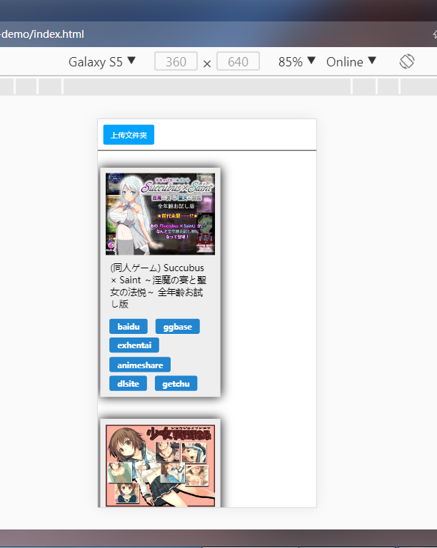
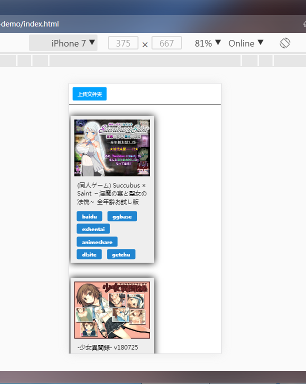
注意:因为 font-size 下限是 12px,所以极小字体可能引起样式误差。当缩放比例小于字体下限发生误差,后面的实例中可以看到
其他知识
meta:vp 默写
<meta name="viewport" content="width=device-width, user-scalable=no, initial-scale=1.0, maximum-scale=1.0, minimum-scale=1.0">- meta 没有闭合
- 1width 4scale
- content 值用逗号隔开
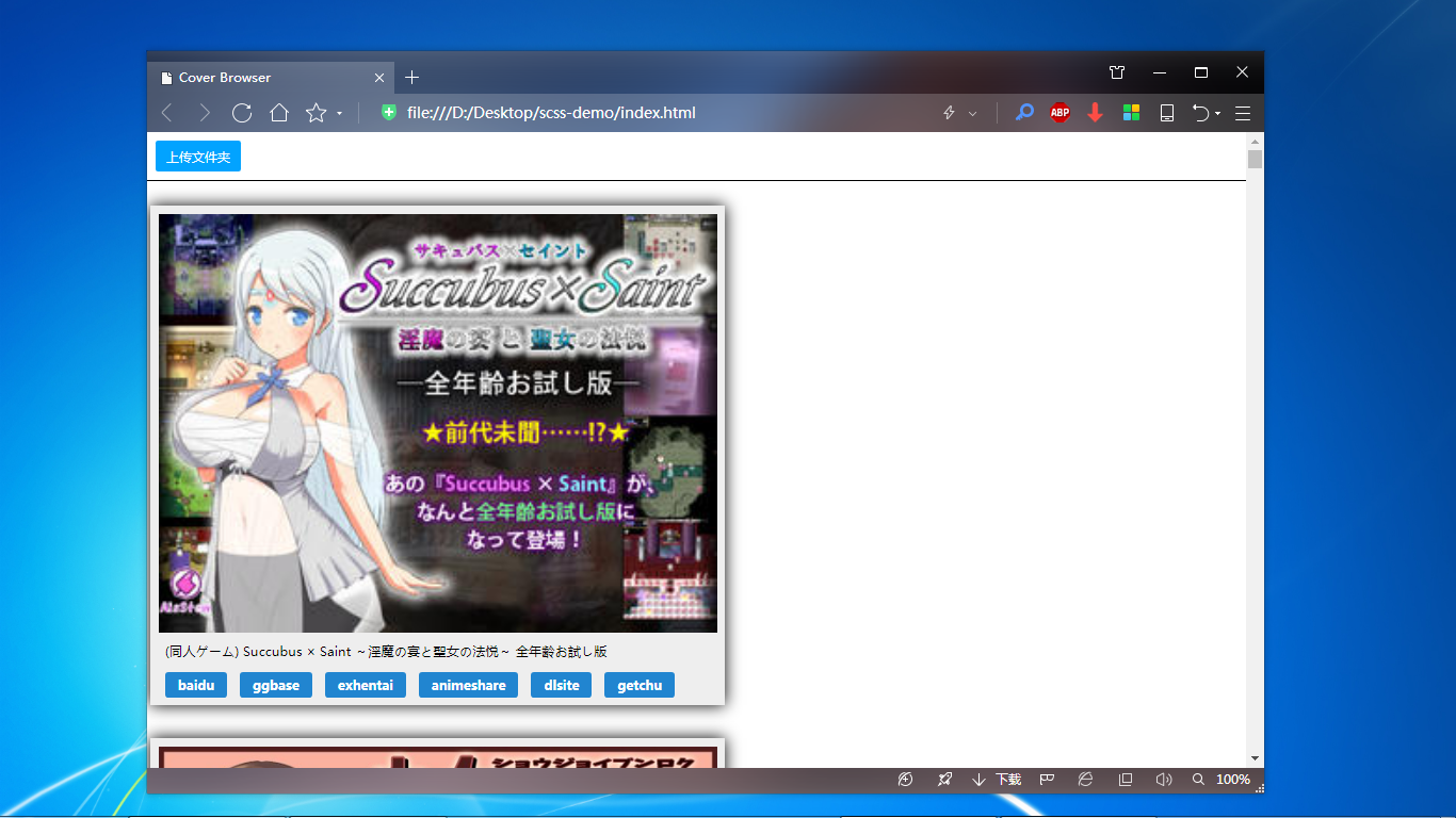
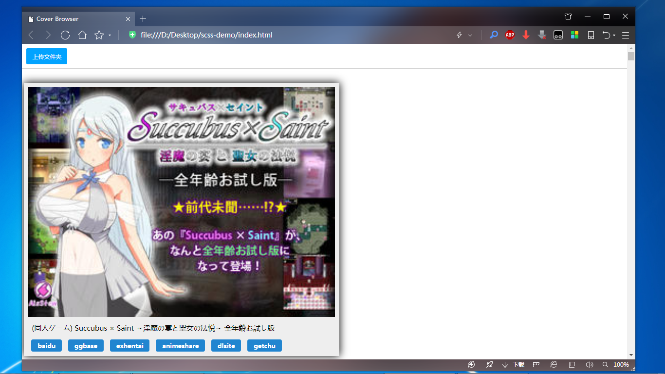
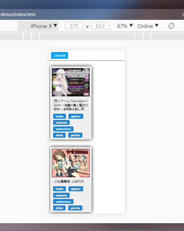
附:px 换算 rem 应用实例
index.html
<!DOCTYPE html>
<html>

<head>
  <meta name="viewport" content="width=device-width, user-scalable=no, maximum-scale=1.0, minimum-scale=1.0">
  <script>
    let pageWidth = window.innerWidth
    document.write(`<style>html{font-size:${pageWidth}px;}</style>`)
  </script>
  <script src="https://cdn.bootcss.com/vue/2.5.22/vue.js"></script>
  <meta charset="utf-8">
  <title>Cover Browser</title>
  <link rel="stylesheet" href="css/style.css">
</head>

<body>
  <main>
    <section class='uploadSection'>
      <input id=uploader multiple webkitdirectory="" directory accept="*/*" type="file" style="display:none;">
      <div id="uploadBtn" class="uploadBtn">上传文件夹</div>
    </section>
    <section class='postsSection'>
      <div id='app' class='app'>
        <ul>
          <li class='post' v-for="post in posts">
            <img class='previewImg' :src="post.img">
            <p>{{post.title}}</p>
            <ul class='queryLinks'>
              <li v-for="link in post.links">
                <a :href="link.href" target="_blank">{{link.name}}</a>
              </li>
            </ul>
          </li>
        </ul>
      </div>
    </section>
  </main>
  <script>
    let queryTemplate = {
      'baidu': 'https://www.baidu.com/s?wd=intitle:****',
      'ggbase': 'https://www.ggbases.com/search.so?title=****',
      'exhentai': 'https://exhentai.org/?f_search=****',
      'animeshare': 'http://www.anime-sharing.com/forum/search.php?do=process&securitytoken=guest&sortby=relevance&order=descending&query=****',
      'dlsite': 'https://www.dlsite.com/home/fsr/=/keyword/****',
      'getchu': 'http://www.getchu.com/php/nsearch.phtml?search_keyword=****'
    }

    uploadBtn.addEventListener('click', triggerUp)
    uploader.addEventListener('click', clearPosts)
    uploader.addEventListener('change', setPosts)

    function triggerUp() {
      uploader.click()
    }

    function clearPosts(e) {
      e.target.value = ''
    }

    function setPosts(e) {
      let files = [...e.currentTarget.files]
      files = files.filter(file => file.name.endsWith('.png') || file.name.endsWith('.jpg'))

      app.posts = files.map(file => {
        let img = window.URL.createObjectURL(file)
        let title = file.name.slice(0, -4)
        let links = makeLinks(title)
        return {
          img, title, links
        }
      })
    }

    function makeLinks(title) {
      let links = []
      for (let key in queryTemplate) {
        let query = queryTemplate[key]
        let queryStr = query.replace('****', title)
        links.push({
          name: key,
          href: queryStr
        })
      }
      return links
    }

    function refreshPosts() {
      app.posts.map(p => p.links = makeLinks(p.title))
    }

    var app = new Vue({
      el: '#app',
      data: {
        posts: []
      }
    })
  </script>
</body>

</html>
style.scss
@function px( $px ){
  @return $px/$designWidth + rem;
}

$designWidth : 1366; // 640 是设计稿的宽度,你要根据设计稿的宽度填写。

* {
  margin: 0;
  padding: 0;
}
ul,
ol {
  list-style: none;
}
body {
  font-size: px(16);
  background: #fff;
}
a {
  color: inherit;
  text-decoration: none;
}
section {
  padding: px(10) 0;
}
section.uploadSection {
  border-bottom: px(1) solid;
  padding-left: px(10);
}
.uploadBtn {
  display: inline-block;
  background-color: #02a3ff;
  color: #fff;
  font-size: px(13);
  border-radius: px(3);
  padding: px(9) px(13);
  cursor: pointer;
}
.app .post {
  display: inline-block;
  max-width: 50vw;
  padding: px(10);
  margin: px(20) px(4);
  background: #eee;
  box-shadow: 0 0 px(30) 0 black;
}
.app .previewImg {
  width: 50vw;
}
.app p {
  padding: .5em;
}
.app .queryLinks {
  display: flex;
  flex-wrap: wrap;
}
.app .queryLinks li {
  display: inline-block;
  margin: .5em 0 0 .5em;
  color: #fff;
  font-weight: bold;
  background-color: #2185d0;
  padding: 0 1em;
  line-height: 2;
  border-radius: px(4);
  text-align: center;
  cursor: pointer;
  margin-right: .5em;
  font-size: px(14);
  box-shadow: px(0) px(1) 0 px(1) rgba(255, 255, 255, .2);
}
style.css
* {
  margin: 0;
  padding: 0; }

ul,
ol {
  list-style: none; }

body {
  font-size: 0.01171rem;
  background: #fff; }

a {
  color: inherit;
  text-decoration: none; }

section {
  padding: 0.00732rem 0; }

section.uploadSection {
  border-bottom: 0.00073rem solid;
  padding-left: 0.00732rem; }

.uploadBtn {
  display: inline-block;
  background-color: #02a3ff;
  color: #fff;
  font-size: 0.00952rem;
  border-radius: 0.0022rem;
  padding: 0.00659rem 0.00952rem;
  cursor: pointer; }

.app .post {
  display: inline-block;
  max-width: 50vw;
  padding: 0.00732rem;
  margin: 0.01464rem 0.00293rem;
  background: #eee;
  box-shadow: 0 0 0.02196rem 0 black; }

.app .previewImg {
  width: 50vw; }

.app p {
  padding: .5em; }

.app .queryLinks {
  display: flex;
  flex-wrap: wrap; }

.app .queryLinks li {
  display: inline-block;
  margin: .5em 0 0 .5em;
  color: #fff;
  font-weight: bold;
  background-color: #2185d0;
  padding: 0 1em;
  line-height: 2;
  border-radius: 0.00293rem;
  text-align: center;
  cursor: pointer;
  margin-right: .5em;
  font-size: 0.01025rem;
  box-shadow: 0rem 0.00073rem 0 0.00073rem rgba(255, 255, 255, 0.2); }
效果
暂无评论